Prompt adherence and aesthetics
Vs 4.0, official MagicBench gains on alignment and aesthetics — style instructions stick closer, less reroll roulette on direction.
ByteDance Seed · Seedream 4.5 · December 2025




Seedream 4.5 is ByteDance Seed's scaled-up image generation and editing model on top of Seedream 4.0 (~December 2025). Official messaging emphasizes accurate subject recognition in multi-image edits, strict reference detail preservation, and continued gains in layout and dense text — suited to posters, e-commerce heroes, product detail pages, and brand visuals. It's not Seedream 5.0 Pro (interactive refinement and dense infographic flagship), and it's not a speed-only draft channel. Blurred type, drifting subjects, lost reference detail — one bad frame can sink a whole ad page or catalog. 4.5's job is to push those failures down on the 4.0 baseline, then decide whether to step up to 5.0 Pro.
Vs 4.0, official MagicBench gains on alignment and aesthetics — style instructions stick closer, less reroll roulette on direction.
Exhibition poster fine print, gym terms lists, e-commerce price bars — one blurred text block and the whole mock is scrap.
In multi-image composites and local rewrites, recognize the main subject and preserve reference detail. Subject drift means rerolling the approved set.
Portrait polish, material swaps, local text fixes — on approved frames, change one spot without tone and identity drifting.
Exhibition posters, e-commerce heroes, perfume detail pages, gym KVs, triptych ads, wedding invites, beauty key visuals — official design frames, not a tech screenshot collage.
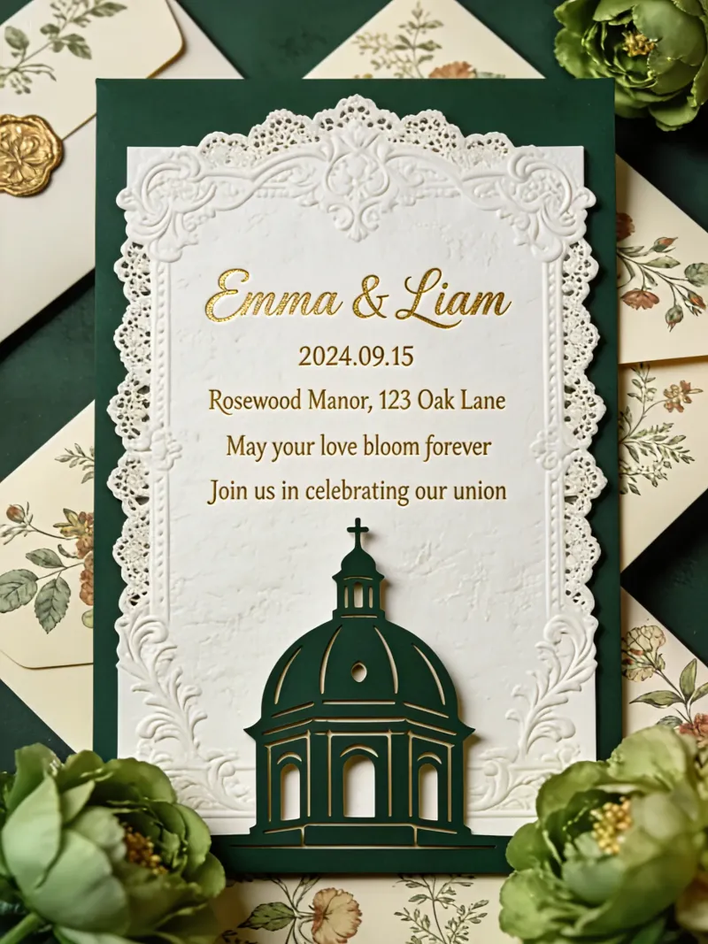
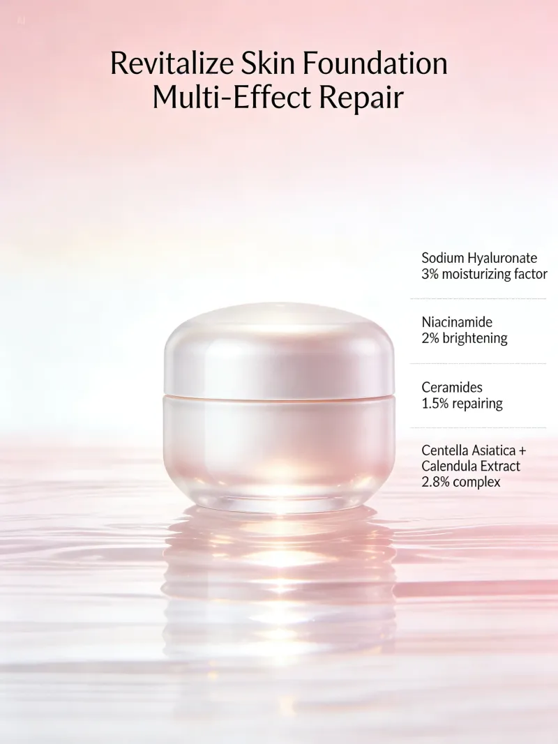
Seedream 4.5 vs Seedream 4.0, Seedream 5.0 Pro, and Nano Banana Pro — design sense, in-image text, editing, portraits, refinement workflow, resolution, speed, and default picks.
| Dimension | Seedream 4.5 | Seedream 4.0 | Seedream 5.0 Pro | Nano Banana Pro |
|---|---|---|---|---|
| Design sense | Strong layout capability | Strong | Best design sense | Short copy readable · localization |
| In-image text | Short copy readable · localization | Short copy usable | High-density layout text | Long multilingual copy readable |
| Editing | High-fidelity edit + identity hold | High-fidelity edit + identity hold | Click · lasso · brush refinement | Local edit · light · depth · color |
| Portraits | Short copy readable · localization | Short copy readable · localization | Short copy readable · localization | Short copy readable · localization |
| Refinement workflow | Basic repaint / variants | Basic repaint / variants | Click · lasso · brush refinement | Local edit · light · depth · color |
| Resolution | Up to ~4K | Up to ~4K | Up to ~4K | Up to ~4K |
| Speed profile | Quality-first channel | Instant fast output + quality tiers | Quality-first channel | Quality-first channel |
| Default pick | Stronger design & text default | Edit-oriented Seedream baseline | Design-native flagship · interactive refine | Premium typography & final polish |
Dense text, multi-image subject lock, reference detail preservation, portrait and material refinement, e-commerce heroes and scene building.
Poster hierarchy, whitespace, and type treated seriously. Drifted style instructions and the whole brand mock set stops matching.
Headlines, price bars, terms lists, and fine exhibition copy stay readable. One blurred line and ads or detail pages are scrap.
Multi-image subject recognition and reference detail on local rewrites. Change one spot and the whole body drifts — approved originals mean rerolling.
Figure outlines, motion, and skin detail stay steadier — one drifted figure and the promo KV set redoes.
Shelf-ready perfume, honey, and similar stills — materials and label type must hold up zoomed in. Fake materials and e-commerce heroes aren't credible.
Miniature worlds and product UI concepts coherent in one frame. Messy elements and the pitch frame won't pass review.
From exhibition posters to e-commerce heroes, annotated diagrams to SaaS UI — mapped to Seed official demos. Work that used to mean a day of hand layout now starts as a reviewable prompt draft.
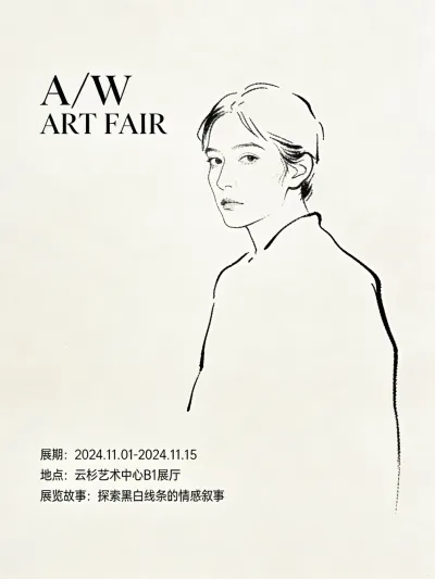
A/W ART FAIR-style serif headline plus fine type bottom-left. Blurred fine print and the print proof is dead on arrival.
Gym-style athlete silhouette plus terms list. Messy hierarchy or unreadable type and the KV can't ship.
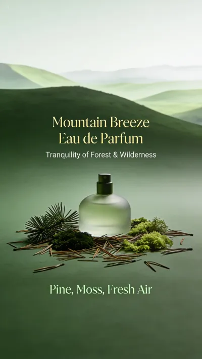
Centered product with layered selling copy. Broken label type or fake materials and detail-page conversion drops.
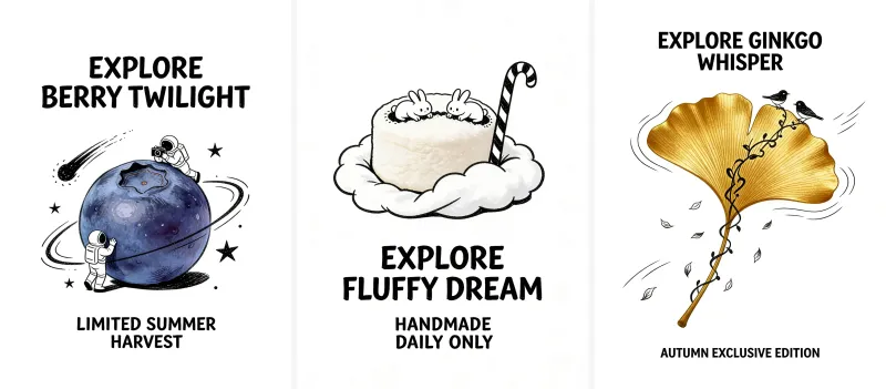
Blueberry / cotton candy / ginkgo triptych with unified headline style. One off-style frame and the whole series is scrap.
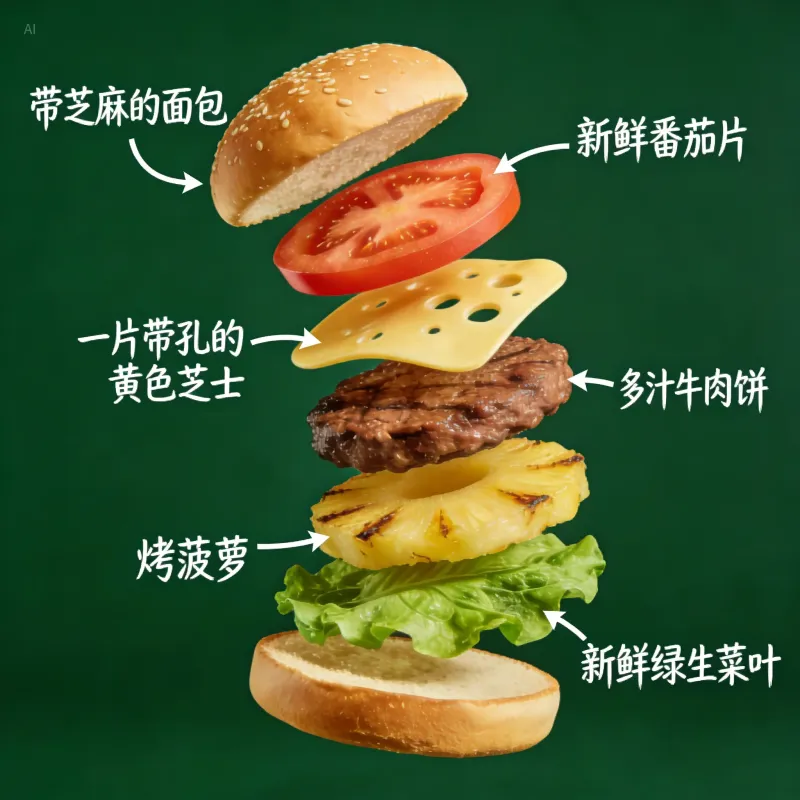
Layered diagrams with handwritten arrow annotations. Wrong translation or arrow and the teaching page is unusable.
Today's Hot Sale plus price bar plus product still. Blurred price type and the hero can't go live.
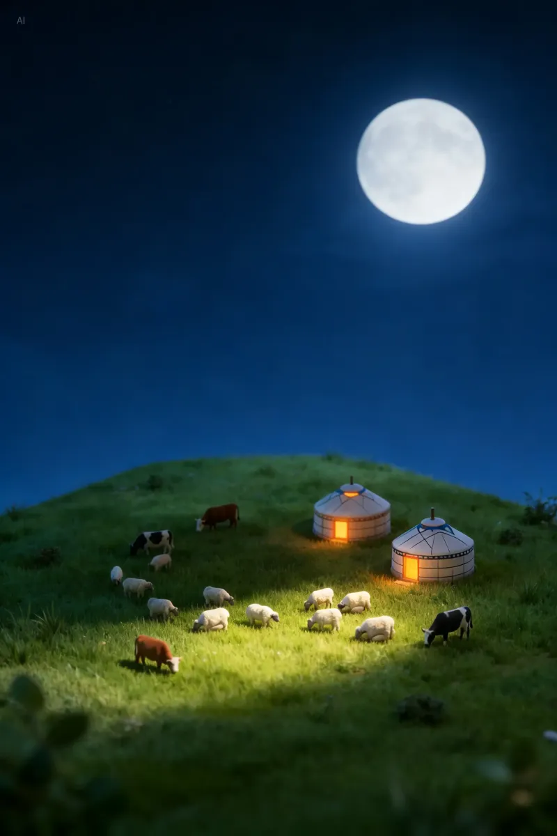
Yurt night miniature world — pitch scene board. Unstable light or subject and the concept won't pass review.
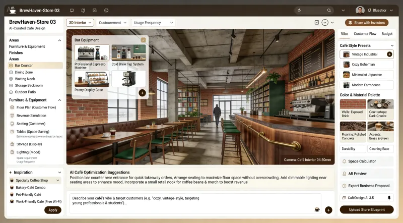
Café-design SaaS dark UI. Unreadable fields and nav type and the demo won't pass review.
When deliverables move from draft to reviewable mock, the gap shows in print-ready dense text, multi-image edit drift, and whether to step up to 5.0 Pro interactive refinement — these teams default to Seedream 4.5.
Promo heroes and product detail. Reshooting every SKU once kills the schedule — generate first passes for review.
Posters and ad series as discussable first passes. Lock direction, then hand off to 5.0 Pro or human polish.
Campaign KVs and terms-heavy posters. Broken type often kills the whole comp — readability comes first.
Annotated explainers and series covers. One wrong annotation layer and the explainer isn't trustworthy.
Client changes copy or material — keep subject and tone as intact as possible and skip a full rebuild round.
Local rewrites and variants on approved photos. Lost reference detail breaks the retouch chain.
Select Seedream 4.5 in the iMini image workspace — same account as Seedream 4.0 and 5.0 Pro.
State layout, text that must stay readable (in quotes), and reference images to lock.
Download what works, or compare side by side with Seedream 4.0 / 5.0 Pro and Nano Banana Pro before stepping up.
Close to Seed official demos. Hover for full text, copy in one click, run on iMini; Chinese prompts supported.
Minimalist art exhibition poster, off-white background, black line-art portrait on the right. Top-left serif headline "A/W ART FAIR". Bottom-left three lines of very small type: dates, venue, exhibition story, left-aligned, even line spacing.
Black-orange dynamic gym promo key visual, center running athlete silhouette with motion blur on limbs. Large headline "UNLEASH YOUR POTENTIAL", terms list on the left, "JOIN US TODAY" bottom-right, clear readable letterforms.
Premium perfume detail page, deep green and light green palette. Frosted glass bottle among pine needles and moss, headline "Mountain Breeze" / "Eau de Parfum", bottom ingredients "Pine, Moss, Fresh Air", restrained elegant copy.
Three vertical creative ads side by side: fresh blueberries with hand-drawn doodles, fluffy cotton candy with hand-drawn doodles, ginkgo leaves with hand-drawn doodles. Unified uppercase sans-serif headlines top and bottom, consistent style, clean whitespace.
Worth reading before you generate: free credits, how to choose vs 4.0 / 5.0 Pro, text and editing expectations.
Dense text · multi-image subject lock · ~2K–4K — compare with Seedream 4.0 and 5.0 Pro on one screen.
Generate free on iMiniNo vendor API key — your iMini account is enough.
.png.png!w640_webp)